What I learned
I've learned a lot about the MAYA software, 3D modeling and rendering, as well as utilizing the Adobe suite to create and alter animations. I also learned that I can apply video effects through it, and will likely continue to use that skill.
How I learned it
Essentially, a lot of instruction, tutorials, and trial and error. I still have more learning to do, actually.
Its importance
Animation has many forms in media today, and being able to create in more than one form is useful to the industry and appealing to possible employers. Animation is a growing industry, and as such, it is becoming a more competitive one as well. It pays to have skill, literally.
My strengths and weaknesses
I honestly have very low self-esteem, so I can't really list strengths when I doubt I have any. My weaknesses are numerous and include being bad at following deadlines, as well as just generally being a slow worker. I know I've improved my knowledge base and skillset from last year, but I'm still needing to improve my work ethic and motivation.
How I will use my learning
I will continue to pursue education throughout high school and learn more, so that I may use it in the future for careers or as a hobby. I will be able to assist people who need it, if asked.
What I would change
I would maybe extend deadlines, given that I would mostly complete projects but then not finish because a new project came along.
In short
The classroom environment is low-stress, and I have a lot of friends in the course. I've become more proficient since last year, but not much faster. I have things to work on, and I have things I'm good at.
Thursday, May 19, 2016

Monday, January 11, 2016
Final: Business Cards
The project scope was basically window shopping this professional business card site for a nice layout style and employing it in our own original cards. The first had to have an original pattern, the second required a photograph.
So, after having trolled moo.com for some 80 minutes, and with some guidance, I found a few appealing layouts. Two of them got scrapped in the decision-making process, and the last, shown below, was my final choice.


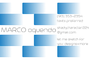
And here it is. The pattern on this card is horizontal rather than vertical.

 It's harder to notice than I expected, but this card does have a white border. Based on this:
 I liked the vertical layout, with the large logo and use of space.
So, after having trolled moo.com for some 80 minutes, and with some guidance, I found a few appealing layouts. Two of them got scrapped in the decision-making process, and the last, shown below, was my final choice.


Pictured above is the template "Circuit Training," chosen for its repeating sides. I captured that with my pattern card:

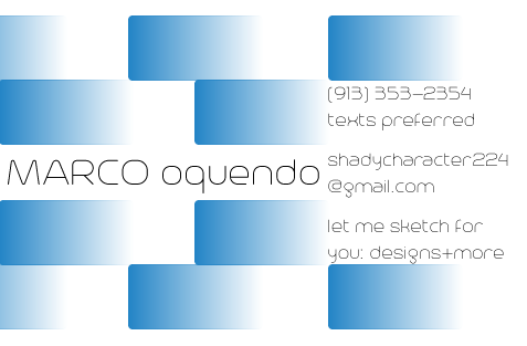


Thursday, December 10, 2015
Logo + Design Process

This logo was made in Adobe Illustrator CS6.
The idea I had was to seem, in a word, unique. Diverse. Variant. Going against the flow. Sound familiar? You may recall the older design from this post from late winter/early spring of 2015. It also represents (slightly) my disdain for unnecessary censorship. I despise the phrase "shut up" more than you could possibly imagine.
I understand it has a few mistakes, but it might actually be better that way to further personify my message. It began with a page of sketches, and several wordmarks and background designs. The shift from font styles was even something I noted in the sketchbook. There was some assistance in the decision making process, and it led to the design above.
Digitizing the sketch was actually really simple. I took a few basic principles and implemented them, the foremost being the blue and red contrast. Practically the entire logo screams "contrast"--the fonts, the rectangles and circles, and of course the aforementioned colors. (It's an aesthetic of mine, the other being balance.)
The fonts were my first order of business. I took to font download websites in search of the perfect ones (figuratively). I eventually came across the serif font AB-Nirvana, reminiscent of Times New Roman, but with a certain flair, most prominent on that u there, and the sans-serif decorative Trench, labeled as a humanist font. Of course, both were modified after I created outlines, and the result was beautiful in my opinion. A small note, though: the spiral tail off the t wasn't from typing and altering, that was created via an almost perfectly placed spiral tool. I say "almost" because the error is visible.
The various shapes were the final part, and the simplest by far. The rounded rectangles, stroke and fill set to Fading Sky (one from the preset color book); the circles, stroke and fill discovered by browsing other color books for gradients.
Overall, a good result, not too simple yet not too complex.
Thursday, August 20, 2015
Why Graphic Design Clicks (for me)
*Please note: this applies only to me. You should not expect to feel exactly the same way. If you do, that's cool, I guess.*
Graphic design is almost all about the humanity--your projects have to connect with your audience and you evoke certain emotions. That is extremely fascinating. Of course, there is more than that that makes graphic design so interesting. Color theory is one of the coolest things out there. Who knew colors made you hungry? You must pick and choose your color template according to what you want others to feel. Psychology ties in tremendously to graphic design, and dictates how people perceive your work. That is something to be amazed by.
Graphic design is fascinating, interesting, amazing, and colorful.
Graphic design is almost all about the humanity--your projects have to connect with your audience and you evoke certain emotions. That is extremely fascinating. Of course, there is more than that that makes graphic design so interesting. Color theory is one of the coolest things out there. Who knew colors made you hungry? You must pick and choose your color template according to what you want others to feel. Psychology ties in tremendously to graphic design, and dictates how people perceive your work. That is something to be amazed by.
Graphic design is fascinating, interesting, amazing, and colorful.
Sunday, July 19, 2015
My default font--?!
Somehow, the default font has been changed. Know that I did not change it. It looks a tad bit feminine now.
Monday, May 18, 2015
Stellar Co. Collaboration Reflection
The instruction given for this project was to come up with a product to market and advertise. We were to have a company website, a commercial, coupon, ad, and animation.
Our product is Space Specs, the newest form of telescope technology. Telescopic glasses. We came up with a bunch of random product ideas at first, including an aerosol force field and complimentary removal kit, but we settled on this one. Mainly because it was the most realistic idea we had, since there definitely won't be any aerosol force fields for decades to come.
We did a few initial sketches of the product that really didn't look that good, and we had already decided on the buttons and functions of the product.
I was responsible for the group's animation, and coupon, and I also assisted in website revisions. However, I was not responsible for the website, product, packaging or final video draft, therefore I will not talk about them in detail.
The animation was rather time-consuming, mainly due to the necessity of all the other components involved: product, packaging and typography. I did have to work around several difficulties. One was dealing with components, another was positioning the text produced by another member. The former was an easy fix involving an explosion, the latter was a bit more complicated, causing me to seek authoritative assistance. In the end it turned out well.
Our coupon was pretty easy to make, all I really had to do was Photoshop some logos and text into it, and then make a free bar code that I pasted into it. Our offer on the coupon is more unique than others: we not only had a BOGO offer, but another 2 pairs of Space Specs at half price.
BUY NOW BUY NOW BUY NOW. One pair is only $35. BUY NOW BUY NOW BUY NOW.
 My edit of the video was not the final cut we settled on. Even I don't think it was as good as the one we agreed upon.
Looking back, I really think we should have gone with that aerosol force field. I feel that this project could have been ten times more humorous than it was, and humor is something that everyone likes in a commercial. Like that Progressive commercial: "I didn't turn your daughter into a rooster, she just looks like that." "Burn the witch!" And those Geico commercials lately. Humor would have made the project better, but that doesn't mean it wasn't good as is. I believe we did a great job.
Our product is Space Specs, the newest form of telescope technology. Telescopic glasses. We came up with a bunch of random product ideas at first, including an aerosol force field and complimentary removal kit, but we settled on this one. Mainly because it was the most realistic idea we had, since there definitely won't be any aerosol force fields for decades to come.
We did a few initial sketches of the product that really didn't look that good, and we had already decided on the buttons and functions of the product.
I was responsible for the group's animation, and coupon, and I also assisted in website revisions. However, I was not responsible for the website, product, packaging or final video draft, therefore I will not talk about them in detail.
The animation was rather time-consuming, mainly due to the necessity of all the other components involved: product, packaging and typography. I did have to work around several difficulties. One was dealing with components, another was positioning the text produced by another member. The former was an easy fix involving an explosion, the latter was a bit more complicated, causing me to seek authoritative assistance. In the end it turned out well.
Our coupon was pretty easy to make, all I really had to do was Photoshop some logos and text into it, and then make a free bar code that I pasted into it. Our offer on the coupon is more unique than others: we not only had a BOGO offer, but another 2 pairs of Space Specs at half price.
BUY NOW BUY NOW BUY NOW. One pair is only $35. BUY NOW BUY NOW BUY NOW.

Looking back, I really think we should have gone with that aerosol force field. I feel that this project could have been ten times more humorous than it was, and humor is something that everyone likes in a commercial. Like that Progressive commercial: "I didn't turn your daughter into a rooster, she just looks like that." "Burn the witch!" And those Geico commercials lately. Humor would have made the project better, but that doesn't mean it wasn't good as is. I believe we did a great job.
Thursday, April 23, 2015
Space Specs Advert
Our group, Stellar Co., is pioneering the furthering of exploration with our new product, Space Specs. Space Specs are glasses with telescopic technology, but they only look like normal glasses. Stylish and efficient, they are able to view whole constellations even when they are out of season, can point out planets and stars that are invisible otherwise, and zoom in and out. When fully zoomed out, they act as normal glasses so that you can always have them.
The Space Specs TV spot demonstrates how the product beats conventional telescopes and how they're great for everyone! Space Specs can be utilized as convenient teaching tools for the classroom, as industrial equipment for offices and observatories, or whenever and wherever you want. This infomercial is 1:15. Cue red "X."
For infinite exploration--Stellar Co.'s Space Specs.
Call toll-free at 1-800-369-2468 or visit spacespecs.com.
Tuesday, February 24, 2015
Photoshop Projects
Not to brag or anything... but these are pretty neat.


 If you must know, the reason there are two of these butterflies is because it was specified to be in the GIF format, but I thought JPEG would look better.
Moving on.
All of these were--you guessed it--made using Adobe Photoshop CS6! Wow! Isn't it wonderful?
I'll start by touching on each project.
Project 1 is the last picture, the bottom picture, the picture with the huge semi-transparent "ONW" overlaid on a semi-transparent compass. I got to learn the basics of Photoshop, the very basic basics, and use transparency and overlaying skills. There was no difficulty in this project. In fact, a baby could do it with its hands behind its back while sleeping.
Okay, so maybe that last part is a lie.
Project 2 was our monarchs that we edited. We multi-selected symmetrical areas of the wings and modified the hues and saturation levels. The blur effect (which I accidentally made asymmetrical) was achieved through the use of the [Clone Stamp Tool], which is a pretty handy tool. By selecting a source point from which to copy, i.e. the wing, you can copy it and adjust how it is copied, i.e. the opacity and transparency levels. All in all, this was a fun project. Yes indeed.
Project 3 involved the [Mask] and [Gradient] tools. By utilizing the [Horizontal Type Mask Tool], and inverting the selection of the letters, I was able to "cut out" the letters from a gradient overlaid on a picture of the school.
Project 4, at the very top, took elements from all 3 projects to create a collage. Yeah, that was fun. Layer effects are fun.
All of the projects are pretty easy to do, and with basic knowledge of the Photoshop toolkit, normal people (i.e. anyone who isn't a photo editor or graphic designer) can do cool things with photos, like removing people's mouths from their photos, leaving them with blank skin.
Moving on.
All of these were--you guessed it--made using Adobe Photoshop CS6! Wow! Isn't it wonderful?
I'll start by touching on each project.
Project 1 is the last picture, the bottom picture, the picture with the huge semi-transparent "ONW" overlaid on a semi-transparent compass. I got to learn the basics of Photoshop, the very basic basics, and use transparency and overlaying skills. There was no difficulty in this project. In fact, a baby could do it with its hands behind its back while sleeping.
Okay, so maybe that last part is a lie.
Project 2 was our monarchs that we edited. We multi-selected symmetrical areas of the wings and modified the hues and saturation levels. The blur effect (which I accidentally made asymmetrical) was achieved through the use of the [Clone Stamp Tool], which is a pretty handy tool. By selecting a source point from which to copy, i.e. the wing, you can copy it and adjust how it is copied, i.e. the opacity and transparency levels. All in all, this was a fun project. Yes indeed.
Project 3 involved the [Mask] and [Gradient] tools. By utilizing the [Horizontal Type Mask Tool], and inverting the selection of the letters, I was able to "cut out" the letters from a gradient overlaid on a picture of the school.
Project 4, at the very top, took elements from all 3 projects to create a collage. Yeah, that was fun. Layer effects are fun.
All of the projects are pretty easy to do, and with basic knowledge of the Photoshop toolkit, normal people (i.e. anyone who isn't a photo editor or graphic designer) can do cool things with photos, like removing people's mouths from their photos, leaving them with blank skin.
Tuesday, February 3, 2015
Personalized Logo Design
(Found out how to revert to my default font. Yes, this is it.)
This logo is meant to represent me.
 Excuse the sloppiness. There wasn't a paint bucket tool, so I improvised.
Each shape, color and font I used holds its own meaning. The triangles represent ambition, as with the color red, while blue represents logic. Hence the name "Against the Flow."The word "against" is typed in the sophisticated [Copperplate], while "the" and "flow" are in the simpler [Eurostile]. The opposite element between the blue and the red also pertains to that name. The meaning of the name itself is more or less self-explanatory: I'm different, and that's okay.
This logo is meant to represent me.
Each shape, color and font I used holds its own meaning. The triangles represent ambition, as with the color red, while blue represents logic. Hence the name "Against the Flow."The word "against" is typed in the sophisticated [Copperplate], while "the" and "flow" are in the simpler [Eurostile]. The opposite element between the blue and the red also pertains to that name. The meaning of the name itself is more or less self-explanatory: I'm different, and that's okay.
Tuesday, January 20, 2015
Stuff and Things with Color
Did you know: The color pink is proven to effectively reduce aggression in people. Why? Who knows? It just does. Go paint your home pink, it should make everyone quiet down a bit.
I'm starting the semester fresh with [Graphic Design], and first we touched on color, including color psychology. Color psychology has to be the most fascinating thing you may ever learn about color. Black and white, which you might have noticed are the main mediums of my blog site, represent sophistication (forget all the negative associations with black for a second please) and formality. And the innocence thing with white? Nope.
Thinking about switching to green for the site. Green is associated with healthiness & wellness.
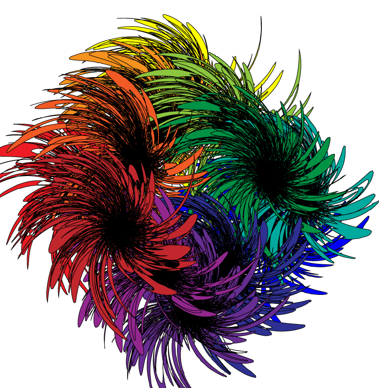
IN OTHER NEWS, time for the usual attachment round-up:

I'm starting the semester fresh with [Graphic Design], and first we touched on color, including color psychology. Color psychology has to be the most fascinating thing you may ever learn about color. Black and white, which you might have noticed are the main mediums of my blog site, represent sophistication (forget all the negative associations with black for a second please) and formality. And the innocence thing with white? Nope.
Thinking about switching to green for the site. Green is associated with healthiness & wellness.
IN OTHER NEWS, time for the usual attachment round-up:
Thursday, December 18, 2014
Final
This quarter entailed a lot of filming and fun. I think I speak for most of us when I say the chase scene videos were the best all quarter. We had to make up the craziest of stories and do the craziest things on campus, and I thought that was great. Last week, I talked about it with Shane Dolan, and he commented on how he saw us filming our chase scene. You can actually catch him in one of our shots (cameo appearance for the win). I liked filming a lot, because the filming had to be done often in creative ways. Storyboarding allowed my artistic ability to shine (though I'm probably half as good as Maria Caputo or my old friend Dylan Sirivongxay) and that was pretty nice. I've learned a lot of things about filming now, and with "director of photography" under my list of possible career choices, the things I learned will probably help going forward.
Web Project
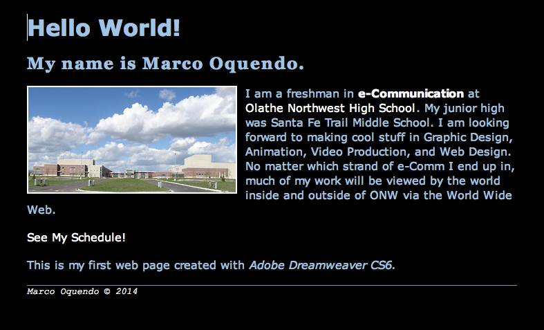
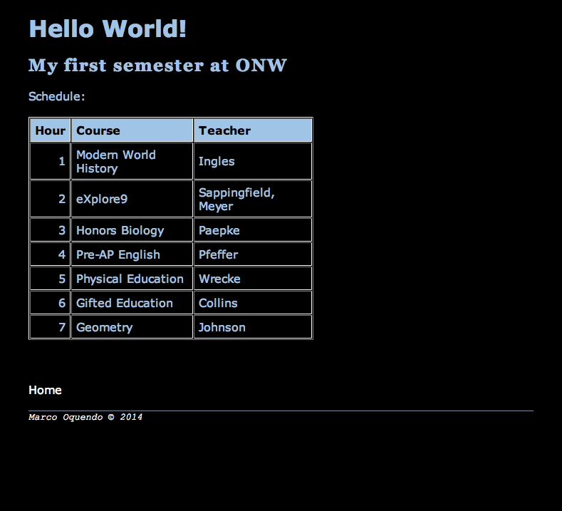
The project was basically to follow step by step instructions with visual aid to construct a pre-defined site. There were some choices you had control over, but it was largely preordained in regards to site design and parameters. With the visual aid and the steps detailed, the project could hardly be called difficult. It was interesting too. The one thing about it that I didn't like was that I couldn't embed my chase scene! Web design is complex when done in certain ways, but there are easier ways of making sites, i.e. Weebly and Wix. I myself have a few published Weebly sites, but under the Weebly subdomain as I cannot afford my own domain name.
Thursday, December 11, 2014
Use Python!
Simple Python Interpreter
Online Python Interpreter
Put your Python code below (copy-and-paste or just type it in directly), then click run.
Note: this isn't a complete version of Python. See below.
Simple commands:
print ("[what you want to appear as text]")
variable = raw_input("[question to be answered in text to define a variable value, should be words]")
The variable may now be used like so:
name = raw_input("What's your name?")
print ("Hello, " + name + ".")
Or:
name = raw_input("What's your name?")
favfood = raw_input(name + ", what's your favorite food?")
You can use a variable value and divert it to separate uses:
if favfood == "Pasta": print ("Mine too!")
if favfood == "Gorgonzola": print ("No thanks!")
Have fun!
A Python Interpreter
This is a simple online Python interpreter, built using the Skulpt engine (slightly modified by kwalsh).Put your Python code below (copy-and-paste or just type it in directly), then click run.
Note: this isn't a complete version of Python. See below.
Simple commands:
print ("[what you want to appear as text]")
variable = raw_input("[question to be answered in text to define a variable value, should be words]")
The variable may now be used like so:
name = raw_input("What's your name?")
print ("Hello, " + name + ".")
Or:
name = raw_input("What's your name?")
favfood = raw_input(name + ", what's your favorite food?")
You can use a variable value and divert it to separate uses:
if favfood == "Pasta": print ("Mine too!")
if favfood == "Gorgonzola": print ("No thanks!")
Have fun!
Thursday, December 4, 2014
The Chase Scene
I have now learned that
I've learned to really cut back on the jump-cut issues as well.
In this video, our entire group was acting. This made the video a lot more energetic, and enhanced realism. I mean, in what universe can you have a person being chased by another without more people around?
We'll have to improve on our collaboration in a few more ways, though. We need to work on planning in advance for sure.
*Side note: Chase scenes are fun!*
Monday, December 1, 2014
A-B Sequence
The A-B sequence is kind of like a double six shot sequence; the hard part is framing each shot so as to avoid jump-cuts. Each of the usual six shots must be used at least twice throughout, but more may be captured to avoid jump-cuts.
Keeping this in mind, I can go into my next video prepared with extra shots ready to capture. I must remember that two of any shot back-to-back make a jump-cut.
Collaboration is a fundamental part of all these video projects, as I am clearly not portrayed in these videos, but rather someone else is acting. Collaboration is, in a word, teamwork. Each of us agreed on how we would capture our shots and how we would act in them. Which is redundant; you'll see the same explanation in the blog posts of the others who conduct this same project.
Keeping this in mind, I can go into my next video prepared with extra shots ready to capture. I must remember that two of any shot back-to-back make a jump-cut.
Collaboration is a fundamental part of all these video projects, as I am clearly not portrayed in these videos, but rather someone else is acting. Collaboration is, in a word, teamwork. Each of us agreed on how we would capture our shots and how we would act in them. Which is redundant; you'll see the same explanation in the blog posts of the others who conduct this same project.
Six Shot Sequence
The six shot sequence contains, as one could easily guess, six different shots. They are as follows (but can be in any order): close up, extra close up, wide shot, medium shot, extra wide shot, and an over the shoulder shot.
Each one is slightly self-explanatory, but I'll describe each anyway:
--Closeup: Frames the face but without cutting any portion of the head out of the frame. This shot is used to capture emotion and reactions.
--Extra closeup: A shot focusing on the hands or feet, which must be performing some kind of an action.
--Wide shot: Frames the entire person, with a bit of room above and below the person so as not to cut any part of them from the frame.
--Extra wide shot: Frames a person and their surroundings. The person is much smaller in this frame than in the standard wide shot.
--Medium shot: Frames a person from the waist up or down, with enough room above their head or below their feet to not cut them out.
--Over the shoulder: The easiest to describe by name. It does what it says; it captures what the person is doing from over their shoulder. This is usually framed so that the camera faces the direction the person faces, but can be inverted to where the camera shows things behind the person.
I learned that repetition is NOT good for video. Notice the really quick transition of the shots of the feet? Originally, they were each shots of [name undivulged] kicking the ball, but why jump-cut to 3 kicks? Secondly, some shots toward the middle of the video seem to be jump-cuts and are fairly noticeable. This was an error that couldn't be fixed for the time I had, but is easy to look past.
I plan to apply my knowledge of these kinds of errors to my next video so as not to encounter them again.
Each one is slightly self-explanatory, but I'll describe each anyway:
--Closeup: Frames the face but without cutting any portion of the head out of the frame. This shot is used to capture emotion and reactions.
--Extra closeup: A shot focusing on the hands or feet, which must be performing some kind of an action.
--Wide shot: Frames the entire person, with a bit of room above and below the person so as not to cut any part of them from the frame.
--Extra wide shot: Frames a person and their surroundings. The person is much smaller in this frame than in the standard wide shot.
--Medium shot: Frames a person from the waist up or down, with enough room above their head or below their feet to not cut them out.
--Over the shoulder: The easiest to describe by name. It does what it says; it captures what the person is doing from over their shoulder. This is usually framed so that the camera faces the direction the person faces, but can be inverted to where the camera shows things behind the person.
I learned that repetition is NOT good for video. Notice the really quick transition of the shots of the feet? Originally, they were each shots of [name undivulged] kicking the ball, but why jump-cut to 3 kicks? Secondly, some shots toward the middle of the video seem to be jump-cuts and are fairly noticeable. This was an error that couldn't be fixed for the time I had, but is easy to look past.
I plan to apply my knowledge of these kinds of errors to my next video so as not to encounter them again.
Thursday, October 9, 2014
Meh House


One thing that was important to the course was the overhang. It should have been larger than that and that may have hindered my ability to sell the house. :(
Friday, August 29, 2014
An ISFP? What is THAT?

The Myers-Briggs ISFP is an artist and a creator. It is a quiet, observant and sensitive person with no real organization. This is me. I am an artist, a writer, and a messy person. I can typically envision the world in different ways than others. I prefer to use my hands to do things but am easily able to change my mind. As to a specific career, I am indecisive and have no real game plan for my future.
Subscribe to:
Posts (Atom)