Not to brag or anything... but these are pretty neat.
If you must know, the reason there are two of these butterflies is because it was specified to be in the GIF format, but I thought JPEG would look better.
Moving on.
All of these were--you guessed it--made using Adobe Photoshop CS6! Wow! Isn't it wonderful?
I'll start by touching on each project.
Project 1 is the last picture, the bottom picture, the picture with the huge semi-transparent "ONW" overlaid on a semi-transparent compass. I got to learn the basics of Photoshop, the very basic basics, and use transparency and overlaying skills. There was no difficulty in this project. In fact, a baby could do it with its hands behind its back while sleeping.
Okay, so maybe that last part is a lie.
Project 2 was our monarchs that we edited. We multi-selected symmetrical areas of the wings and modified the hues and saturation levels. The blur effect (which I accidentally made asymmetrical) was achieved through the use of the [Clone Stamp Tool], which is a pretty handy tool. By selecting a source point from which to copy, i.e. the wing, you can copy it and adjust how it is copied, i.e. the opacity and transparency levels. All in all, this was a fun project. Yes indeed.
Project 3 involved the [Mask] and [Gradient] tools. By utilizing the [Horizontal Type Mask Tool], and inverting the selection of the letters, I was able to "cut out" the letters from a gradient overlaid on a picture of the school.
Project 4, at the very top, took elements from all 3 projects to create a collage. Yeah, that was fun. Layer effects are fun.
All of the projects are pretty easy to do, and with basic knowledge of the Photoshop toolkit, normal people (i.e. anyone who isn't a photo editor or graphic designer) can do cool things with photos, like removing people's mouths from their photos, leaving them with blank skin.
Showing posts with label representation. Show all posts
Tuesday, February 24, 2015
Tuesday, February 3, 2015
Personalized Logo Design
(Found out how to revert to my default font. Yes, this is it.)
This logo is meant to represent me.
Excuse the sloppiness. There wasn't a paint bucket tool, so I improvised.
Each shape, color and font I used holds its own meaning. The triangles represent ambition, as with the color red, while blue represents logic. Hence the name "Against the Flow."The word "against" is typed in the sophisticated [Copperplate], while "the" and "flow" are in the simpler [Eurostile]. The opposite element between the blue and the red also pertains to that name. The meaning of the name itself is more or less self-explanatory: I'm different, and that's okay.
This logo is meant to represent me.
Excuse the sloppiness. There wasn't a paint bucket tool, so I improvised.
Each shape, color and font I used holds its own meaning. The triangles represent ambition, as with the color red, while blue represents logic. Hence the name "Against the Flow."The word "against" is typed in the sophisticated [Copperplate], while "the" and "flow" are in the simpler [Eurostile]. The opposite element between the blue and the red also pertains to that name. The meaning of the name itself is more or less self-explanatory: I'm different, and that's okay.
Thursday, December 18, 2014
Web Project
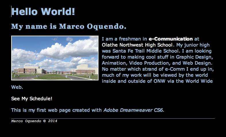
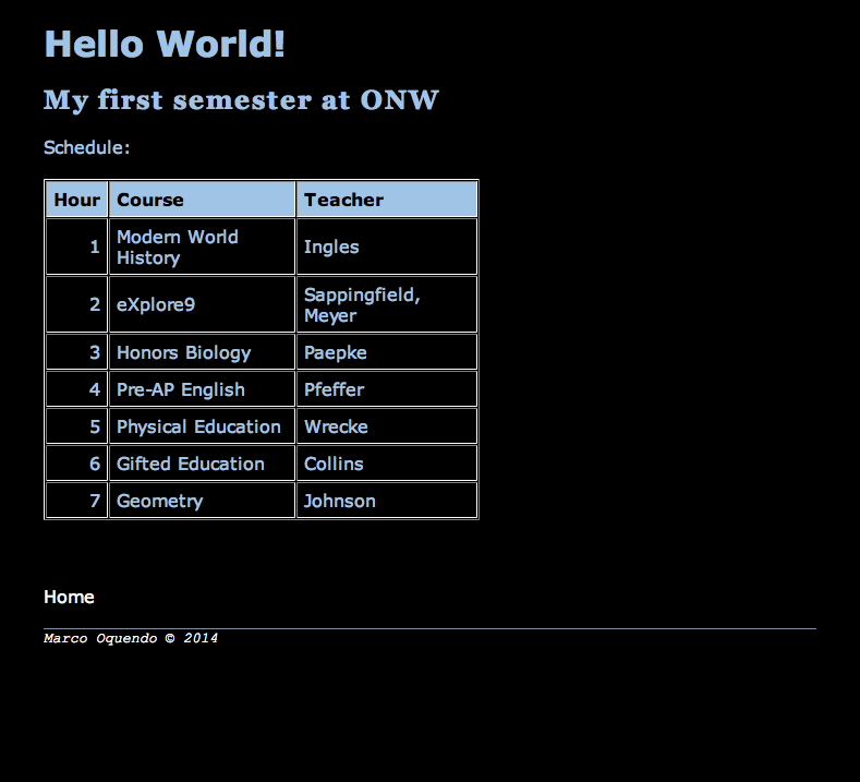
The project was basically to follow step by step instructions with visual aid to construct a pre-defined site. There were some choices you had control over, but it was largely preordained in regards to site design and parameters. With the visual aid and the steps detailed, the project could hardly be called difficult. It was interesting too. The one thing about it that I didn't like was that I couldn't embed my chase scene! Web design is complex when done in certain ways, but there are easier ways of making sites, i.e. Weebly and Wix. I myself have a few published Weebly sites, but under the Weebly subdomain as I cannot afford my own domain name.

Subscribe to:
Posts (Atom)