What I learned
I've learned a lot about the MAYA software, 3D modeling and rendering, as well as utilizing the Adobe suite to create and alter animations. I also learned that I can apply video effects through it, and will likely continue to use that skill.
How I learned it
Essentially, a lot of instruction, tutorials, and trial and error. I still have more learning to do, actually.
Its importance
Animation has many forms in media today, and being able to create in more than one form is useful to the industry and appealing to possible employers. Animation is a growing industry, and as such, it is becoming a more competitive one as well. It pays to have skill, literally.
My strengths and weaknesses
I honestly have very low self-esteem, so I can't really list strengths when I doubt I have any. My weaknesses are numerous and include being bad at following deadlines, as well as just generally being a slow worker. I know I've improved my knowledge base and skillset from last year, but I'm still needing to improve my work ethic and motivation.
How I will use my learning
I will continue to pursue education throughout high school and learn more, so that I may use it in the future for careers or as a hobby. I will be able to assist people who need it, if asked.
What I would change
I would maybe extend deadlines, given that I would mostly complete projects but then not finish because a new project came along.
In short
The classroom environment is low-stress, and I have a lot of friends in the course. I've become more proficient since last year, but not much faster. I have things to work on, and I have things I'm good at.
Thursday, May 19, 2016
Monday, January 11, 2016
Final: Business Cards
The project scope was basically window shopping this professional business card site for a nice layout style and employing it in our own original cards. The first had to have an original pattern, the second required a photograph.
So, after having trolled moo.com for some 80 minutes, and with some guidance, I found a few appealing layouts. Two of them got scrapped in the decision-making process, and the last, shown below, was my final choice.


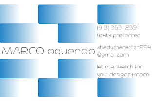
And here it is. The pattern on this card is horizontal rather than vertical.

 It's harder to notice than I expected, but this card does have a white border. Based on this:
 I liked the vertical layout, with the large logo and use of space.
So, after having trolled moo.com for some 80 minutes, and with some guidance, I found a few appealing layouts. Two of them got scrapped in the decision-making process, and the last, shown below, was my final choice.


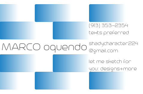
Pictured above is the template "Circuit Training," chosen for its repeating sides. I captured that with my pattern card:


Thursday, December 10, 2015
Logo + Design Process
This logo was made in Adobe Illustrator CS6.
The idea I had was to seem, in a word, unique. Diverse. Variant. Going against the flow. Sound familiar? You may recall the older design from this post from late winter/early spring of 2015. It also represents (slightly) my disdain for unnecessary censorship. I despise the phrase "shut up" more than you could possibly imagine.
I understand it has a few mistakes, but it might actually be better that way to further personify my message. It began with a page of sketches, and several wordmarks and background designs. The shift from font styles was even something I noted in the sketchbook. There was some assistance in the decision making process, and it led to the design above.
Digitizing the sketch was actually really simple. I took a few basic principles and implemented them, the foremost being the blue and red contrast. Practically the entire logo screams "contrast"--the fonts, the rectangles and circles, and of course the aforementioned colors. (It's an aesthetic of mine, the other being balance.)
The fonts were my first order of business. I took to font download websites in search of the perfect ones (figuratively). I eventually came across the serif font AB-Nirvana, reminiscent of Times New Roman, but with a certain flair, most prominent on that u there, and the sans-serif decorative Trench, labeled as a humanist font. Of course, both were modified after I created outlines, and the result was beautiful in my opinion. A small note, though: the spiral tail off the t wasn't from typing and altering, that was created via an almost perfectly placed spiral tool. I say "almost" because the error is visible.
The various shapes were the final part, and the simplest by far. The rounded rectangles, stroke and fill set to Fading Sky (one from the preset color book); the circles, stroke and fill discovered by browsing other color books for gradients.
Overall, a good result, not too simple yet not too complex.
Thursday, August 20, 2015
Why Graphic Design Clicks (for me)
*Please note: this applies only to me. You should not expect to feel exactly the same way. If you do, that's cool, I guess.*
Graphic design is almost all about the humanity--your projects have to connect with your audience and you evoke certain emotions. That is extremely fascinating. Of course, there is more than that that makes graphic design so interesting. Color theory is one of the coolest things out there. Who knew colors made you hungry? You must pick and choose your color template according to what you want others to feel. Psychology ties in tremendously to graphic design, and dictates how people perceive your work. That is something to be amazed by.
Graphic design is fascinating, interesting, amazing, and colorful.
Sunday, July 19, 2015
My default font--?!
Somehow, the default font has been changed. Know that I did not change it. It looks a tad bit feminine now.
Monday, May 18, 2015
Stellar Co. Collaboration Reflection
The instruction given for this project was to come up with a product to market and advertise. We were to have a company website, a commercial, coupon, ad, and animation.
Our product is Space Specs, the newest form of telescope technology. Telescopic glasses. We came up with a bunch of random product ideas at first, including an aerosol force field and complimentary removal kit, but we settled on this one. Mainly because it was the most realistic idea we had, since there definitely won't be any aerosol force fields for decades to come.
We did a few initial sketches of the product that really didn't look that good, and we had already decided on the buttons and functions of the product.
I was responsible for the group's animation, and coupon, and I also assisted in website revisions. However, I was not responsible for the website, product, packaging or final video draft, therefore I will not talk about them in detail.
The animation was rather time-consuming, mainly due to the necessity of all the other components involved: product, packaging and typography. I did have to work around several difficulties. One was dealing with components, another was positioning the text produced by another member. The former was an easy fix involving an explosion, the latter was a bit more complicated, causing me to seek authoritative assistance. In the end it turned out well.
Our coupon was pretty easy to make, all I really had to do was Photoshop some logos and text into it, and then make a free bar code that I pasted into it. Our offer on the coupon is more unique than others: we not only had a BOGO offer, but another 2 pairs of Space Specs at half price.
BUY NOW BUY NOW BUY NOW. One pair is only $35. BUY NOW BUY NOW BUY NOW.
 My edit of the video was not the final cut we settled on. Even I don't think it was as good as the one we agreed upon.
Looking back, I really think we should have gone with that aerosol force field. I feel that this project could have been ten times more humorous than it was, and humor is something that everyone likes in a commercial. Like that Progressive commercial: "I didn't turn your daughter into a rooster, she just looks like that." "Burn the witch!" And those Geico commercials lately. Humor would have made the project better, but that doesn't mean it wasn't good as is. I believe we did a great job.
Our product is Space Specs, the newest form of telescope technology. Telescopic glasses. We came up with a bunch of random product ideas at first, including an aerosol force field and complimentary removal kit, but we settled on this one. Mainly because it was the most realistic idea we had, since there definitely won't be any aerosol force fields for decades to come.
We did a few initial sketches of the product that really didn't look that good, and we had already decided on the buttons and functions of the product.
I was responsible for the group's animation, and coupon, and I also assisted in website revisions. However, I was not responsible for the website, product, packaging or final video draft, therefore I will not talk about them in detail.
The animation was rather time-consuming, mainly due to the necessity of all the other components involved: product, packaging and typography. I did have to work around several difficulties. One was dealing with components, another was positioning the text produced by another member. The former was an easy fix involving an explosion, the latter was a bit more complicated, causing me to seek authoritative assistance. In the end it turned out well.
Our coupon was pretty easy to make, all I really had to do was Photoshop some logos and text into it, and then make a free bar code that I pasted into it. Our offer on the coupon is more unique than others: we not only had a BOGO offer, but another 2 pairs of Space Specs at half price.
BUY NOW BUY NOW BUY NOW. One pair is only $35. BUY NOW BUY NOW BUY NOW.

Looking back, I really think we should have gone with that aerosol force field. I feel that this project could have been ten times more humorous than it was, and humor is something that everyone likes in a commercial. Like that Progressive commercial: "I didn't turn your daughter into a rooster, she just looks like that." "Burn the witch!" And those Geico commercials lately. Humor would have made the project better, but that doesn't mean it wasn't good as is. I believe we did a great job.
Thursday, April 23, 2015
Space Specs Advert
Our group, Stellar Co., is pioneering the furthering of exploration with our new product, Space Specs. Space Specs are glasses with telescopic technology, but they only look like normal glasses. Stylish and efficient, they are able to view whole constellations even when they are out of season, can point out planets and stars that are invisible otherwise, and zoom in and out. When fully zoomed out, they act as normal glasses so that you can always have them.
The Space Specs TV spot demonstrates how the product beats conventional telescopes and how they're great for everyone! Space Specs can be utilized as convenient teaching tools for the classroom, as industrial equipment for offices and observatories, or whenever and wherever you want. This infomercial is 1:15. Cue red "X."
For infinite exploration--Stellar Co.'s Space Specs.
Call toll-free at 1-800-369-2468 or visit spacespecs.com.
Subscribe to:
Posts (Atom)